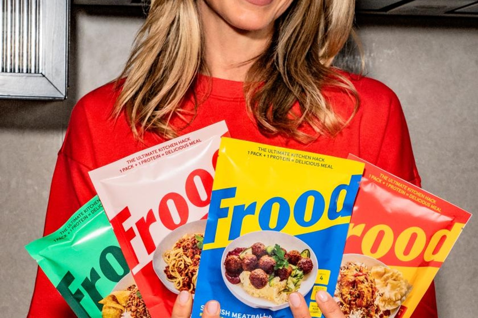
London studio Regular Practice has designed the visual identity for Frood. The new whole-food brand by Frida Redknapp skips the usual serious health-food aesthetic.
Instead, the packaging focuses on bright colors and joy. The cooking blends are now available at M&S and Ocado.
Why it matters
Creative Boom recently highlighted the design launch. The design industry often watches how new brands tackle the crowded health-food market.
Healthy food brands usually fall into a specific visual trap. They often look overly serious, medicinal, or heavily focused on duty.
Frood wanted to avoid feeling like a chore. The brand aims to make healthy eating feel fun.
This bright approach to healthy eating offers a refreshing case study for anyone tracking modern retail trends. Brands are clearly moving away from muted, earthy tones toward bold, playful graphics.
Supermarket shelves remain highly competitive spaces. A new brand needs an immediate visual hook to survive the initial launch window.
The catch
Frida Redknapp launched Frood to offer easy cooking blends. The products target busy families who want whole foods without long prep times.
Regular Practice took on the challenge of making the brand stand out. They needed a look that signaled health without looking boring.
Health foods often rely on guilt or a sense of worthiness to sell products. Frood actively flips this traditional marketing script.
The brand promises that eating well can be a genuinely happy experience. Regular Practice used bold typography to give the brand a loud, confident voice.
The letters on the packaging are chunky and highly approachable. The color choices step away from the standard greens and browns.
Designers used vivid shades to grab attention. This strategy subtly mimics junk food branding by using the visual language of treats to sell nutritious ingredients.
The packaging also features playful illustrations. These simple drawings add a sense of movement to the boxes.
Redknapp’s concept centers entirely on convenience in the kitchen. The cooking blends help people make meals quickly.
The design needed to reflect that speed and ease at a glance. Complex, cluttered packaging would send the wrong message to busy shoppers.
The studio kept the front of the packs remarkably clean. The core message hits the shopper instantly.
Shoppers often make split-second decisions in the grocery store. A strong visual identity can make the difference between a sale and a missed opportunity.
M&S and Ocado picked up the product line for their stores. This placement puts the bright packaging directly next to traditional, serious health brands.
The contrast on the shelf is highly intentional. Frood wants to catch the eye of shoppers who normally skip the health food aisle.
What to verify
- Sales figures at M&S and Ocado will show if the joyful branding actually drives purchases.
- It remains unclear if other whole-food startups will copy this bright aesthetic.
- The exact product lineup and ingredient lists for the Frood cooking blends need closer review.
- Design critics might debate whether the playful packaging confuses consumers about the nutritional value.
- Market analysts will watch to see if Frood expands into other major grocery chains.
Source trail
Creative Boom published the original breakdown of the Regular Practice design for Frood.
The studio’s approach highlights a broader shift in supermarket packaging trends across the food industry.
- Frood is a new whole-food cooking blend brand by Frida Redknapp.
- London studio Regular Practice designed the vibrant packaging.
- The visual identity uses bright colors to avoid looking like a boring health food.
- The products are currently stocked at M&S and Ocado.
What to watch next
The useful follow-up is whether the next reports add verifiable detail: dates, locations, measurements, documents, expert review, or a primary record. The source trail starts with the original Creative Boom report and more Creative Boom coverage while watching for primary-source updates.
Until those details are public, the careful version is to treat the story as interesting evidence in motion rather than a finished conclusion.
That is also why the story is worth treating carefully. It gives the update a concrete object or event to follow, with the limits still attached.