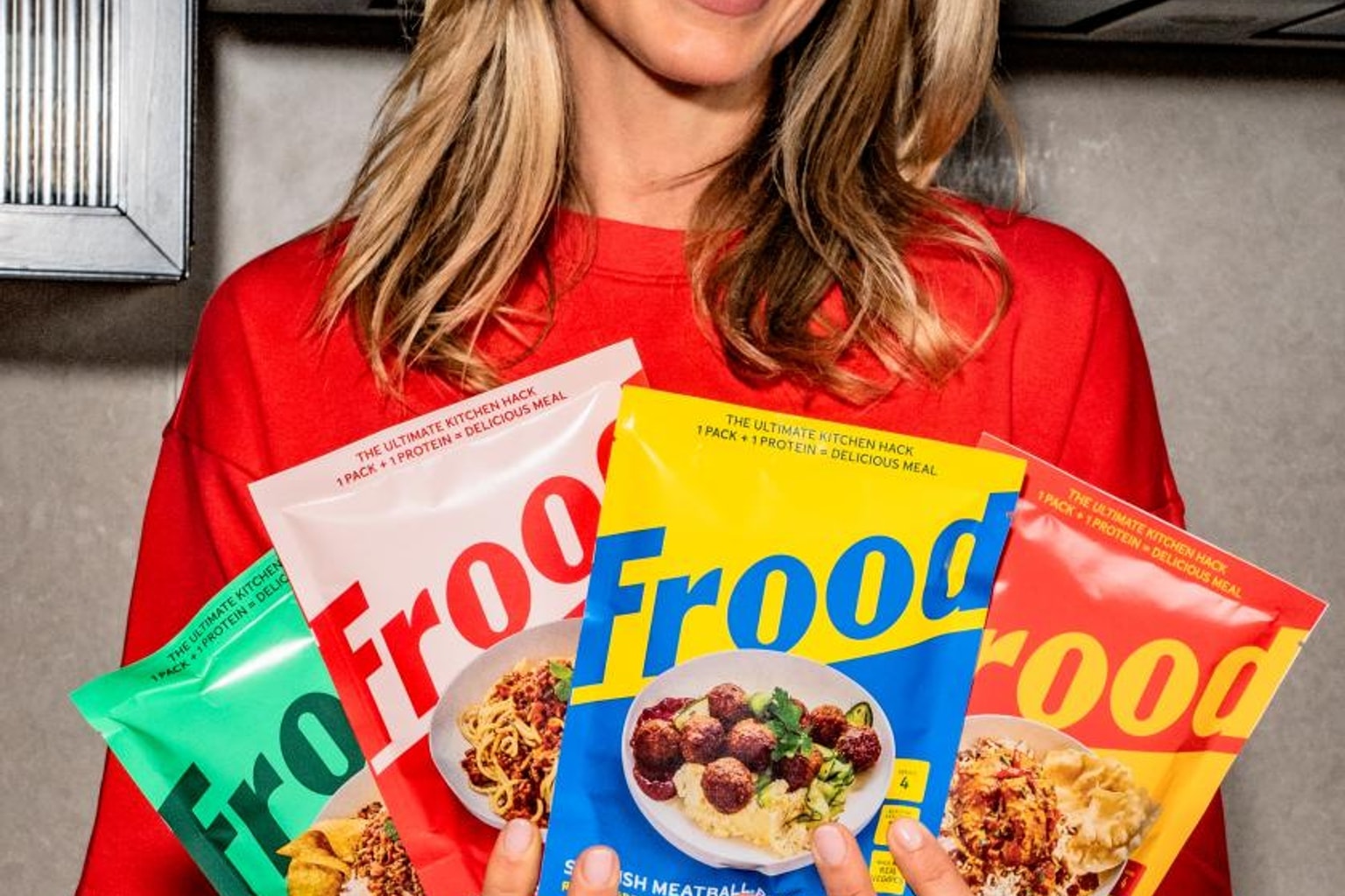
The competitive landscape of premium snacks is shifting, and visual identity is leading the charge. London-based design studio Derek&Eric has recently unveiled a comprehensive brand refresh for the premium tortilla chip maker Manomasa.
Dubbed “Snacks With Spirit,” the redesign aims to reposition the brand by injecting a lively, Latin American-inspired energy into its packaging. This visual overhaul serves as a fascinating case study for marketers and design enthusiasts looking to understand how artisanal brands scale their appeal, making it a highly compelling story to share with anyone tracking retail design trends.
Why it matters
According to recent coverage from Creative Boom, the primary motivation behind the visual pivot is to lift Manomasa out of the traditional “farm-shop aisle” aesthetic. For years, premium snack brands have relied on muted, rustic, or hyper-minimalist packaging to signal quality and artisanal craftsmanship.
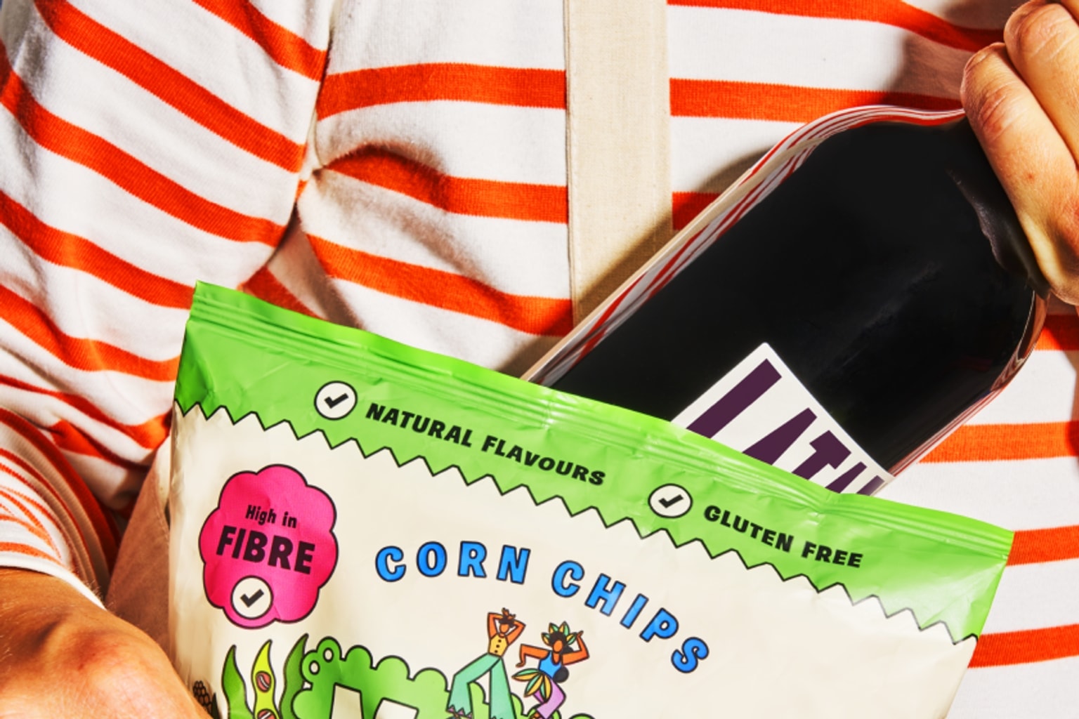
Still, Derek&Eric has taken a sharply different approach for Manomasa. The studio has introduced a highly vibrant new color palette and incorporated lively elements, including dancing mascots, to give the brand a distinct Latin American glow-up.
The creative direction suggests a strategic move to capture attention on crowded supermarket shelves, relying on packaging that visually communicates the bold flavors inside. The current buzz in the design community centers on this energetic departure from the subdued norms of the premium food sector.
The catch
Beyond the surface-level appreciation of a colorful new bag of chips, industry observers are dissecting what this means for the broader food and beverage branding space. the open question is the delicate balance between maintaining a premium price point and embracing a fun, accessible visual identity. Historically, vibrant packaging featuring mascots and bright colors has been relegated to mainstream, lower-tier consumer goods, while premium items opted for austerity. By blending dancing mascots with a high-end product, Derek&Eric is challenging the conventional visual language of luxury snacking. Furthermore, there is an interest in how the “Snacks With Spirit” concept authentically taps into Latin American cultural aesthetics without falling into outdated tropes. The transition from a quiet, rustic farm-shop staple to a dynamic, culturally expressive brand highlights a growing consumer desire for products that offer an emotional and energetic experience, not just a list of high-quality ingredients.
What to verify
Because the design has just been unveiled, several aspects of its market performance remain to be seen. Industry analysts and brand strategists will need to monitor consumer reception to determine if the new vibrant palette successfully attracts a broader demographic without alienating Manomasa’s original customer base.
Also, it will be important to track retail placement—specifically, whether this glow-up helps the brand secure more prominent shelf space in major supermarkets compared to its previous farm-shop positioning. Another point of verification involves the specific execution of the Latin American motifs and dancing mascots; design critics will likely evaluate these elements for cultural resonance and distinctiveness in an increasingly globalized food market.
Finally, observing the rollout across the brand’s entire product portfolio and digital presence will provide a clearer picture of the campaign’s overall cohesion.
Source trail
London design studio Derek&Eric has successfully transformed Manomasa’s visual identity with the “Snacks With Spirit” campaign, trading the brand’s rustic, artisanal roots for a vibrant, energetic Latin American aesthetic. By introducing dancing mascots and bold color palettes, the redesign aims to elevate the premium tortilla chips from niche farm-shop aisles to the center of mainstream retail attention, challenging traditional rules of high-end snack branding.
The details of this branding refresh were originally reported by the art and design publication Creative Boom. The platform frequently covers significant developments in packaging, illustration, and commercial design, highlighting how creative studios like Derek&Eric are reshaping consumer goods.
What to watch next
The useful follow-up is not only that How Derek&Eric gave Manomasa a Latin American glow-up with ‘Snacks With Spirit’ is circulating, but whether the next reports add verifiable detail: dates, locations, measurements, documents, expert review, or a primary record that the public can inspect. The source trail includes more Creative Boom coverage while watching for primary-source updates. Until those details are public, the careful version is to treat the story as interesting evidence in motion rather than a finished conclusion.
That is also why the story is worth treating carefully. It gives the update a concrete object or event to follow, but it should travel with the limits still attached: what is known now, what remains provisional, and what would make the claim stronger when the next update arrives.