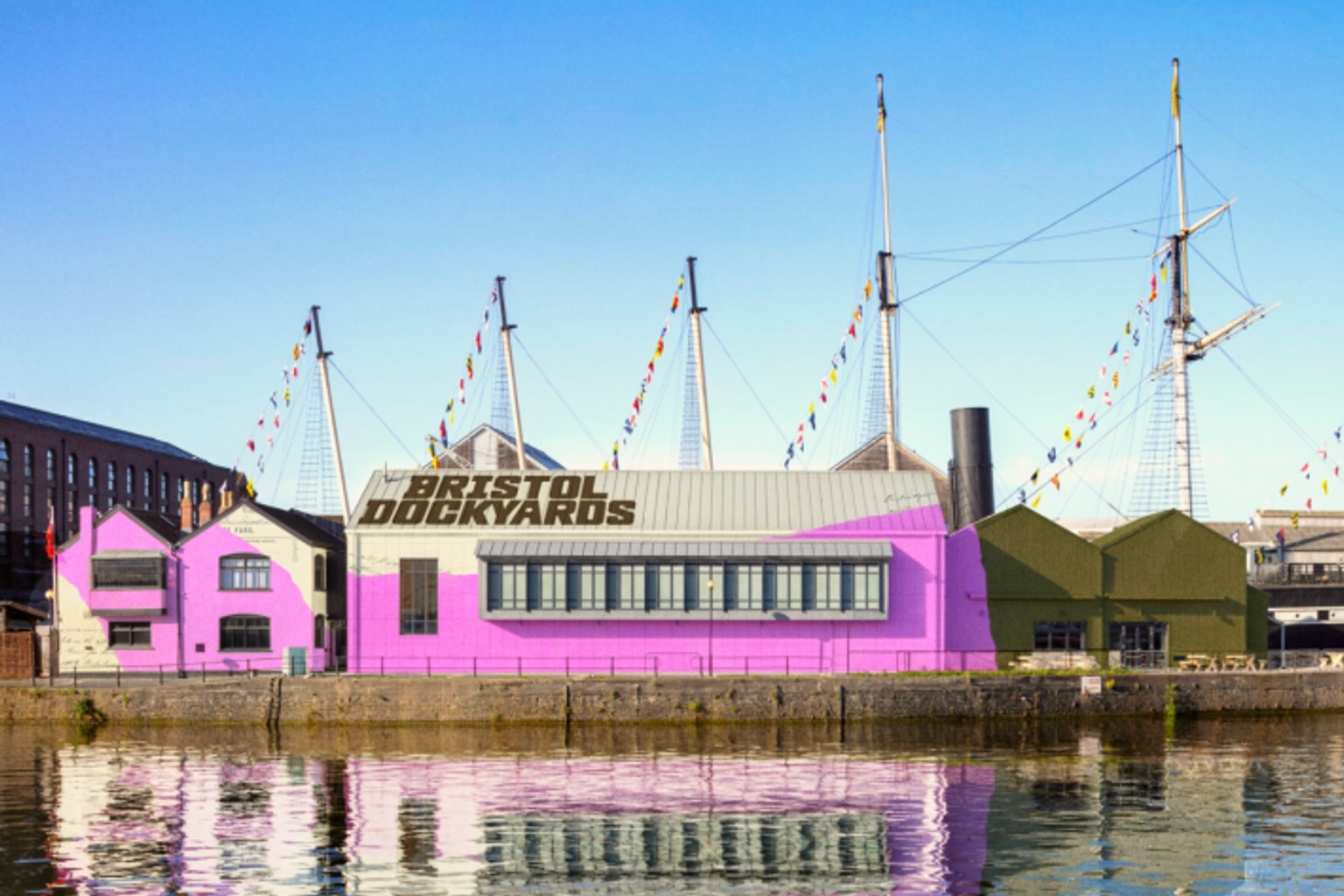
The historic SS Great Britain, long celebrated as a masterpiece of Isambard Kingdom Brunel’s engineering, is undergoing a profound visual and conceptual transformation. According to recent industry reports, the beloved Bristol attraction is being expanded and rebranded as the “Bristol Dockyards” by the design studio How&How.
For enthusiasts of both maritime history and contemporary design, this intersection of nineteenth-century engineering and bold modern branding is a fascinating case study worth sharing to spark conversations about how we preserve and present local heritage. The most striking element of this new identity is its deliberate departure from traditional maritime aesthetics, opting instead for a vibrant, localized color palette.
Why it matters
The design and cultural sectors are now buzzing with the news of this rebranding effort, primarily highlighted by Creative Boom. The attention stems from How&How’s audacious decision to completely eschew expected nautical clichés—there are no navy blues, anchor motifs, or classic maritime stripes to be found here.
Instead, the studio has anchored the new Bristol Dockyards identity in a defiantly un-nautical pink. This specific shade is not arbitrary; it is lifted directly from the famously colorful terraced houses of Totterdown, a steep residential area that forms a recognizable part of the Bristol skyline.
By choosing a color deeply tied to the city’s unique architectural fabric rather than its generic seafaring past, the designers have created a brand that feels distinctly rooted in modern Bristol. This move highlights a growing trend in the heritage sector: moving away from literal historical interpretations toward abstract, community-focused visual identities.
The catch
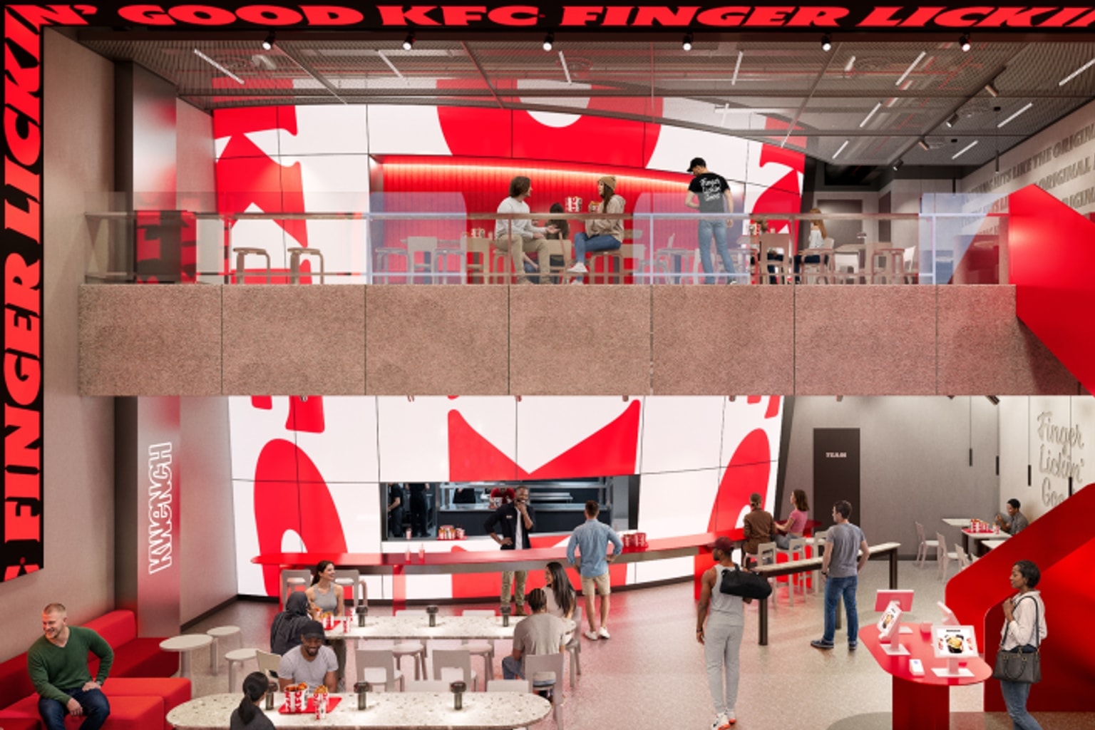
Beyond the striking visual choices, the deeper narrative here is the strategic shift from a single-object attraction to a comprehensive cultural destination. People and prospective visitors are likely trying to parse what the name change from “SS Great Britain” to “Bristol Dockyards” actually signifies for the site. The SS Great Britain has been the star of the show since its preservation in its original dry dock. However, the surrounding area encompasses much more than just the ship itself; it includes historic dockyard buildings, museums, and a wider narrative about Bristol’s complex industrial history. This rebranding suggests an effort to unify these disparate elements under a single, cohesive umbrella. It signals to the public that a visit is no longer just about boarding a historic Victorian passenger liner, but about immersing oneself in an entire historic precinct. This expansion reflects a sophisticated approach to cultural tourism, recognizing that modern audiences seek expansive, multi-layered experiences.
What to verify
While the initial design concepts present a compelling vision, several practical aspects of this transition remain to be confirmed. Observers will need to verify how and when this new “Bristol Dockyards” identity will be physically rolled out across the site’s signage, ticketing, and digital platforms.
Also, it is crucial to monitor the public reception, particularly among local Bristolians and maritime historians who hold a deep affection for the traditional legacy of the SS Great Britain. Will the new Totterdown pink resonate as intended, or will traditionalists push back against the departure from classic aesthetics?
Also, journalists should investigate whether this brand overhaul is accompanied by new physical exhibitions or changes in the site’s educational outreach.
Source trail
Design studio How&How has boldly reimagined the branding for Brunel’s SS Great Britain, expanding its scope to become the Bristol Dockyards. By using a striking pink inspired by local Totterdown architecture rather than traditional nautical colors, the rebrand positions the historic site as a unified, modern cultural destination.
The primary signal for this rebranding initiative comes from the design and visual arts publication Creative Boom. Their coverage focuses on the strategic and aesthetic decisions made by the design studio How&How to transform the iconic ship’s public-facing identity into a broader, modern dockyard experience.