When a multinational fast-food titan decides to overhaul its visual identity across more than 150 countries, the design world pays close attention. KFC has officially launched its largest brand evolution to date, a comprehensive redesign spearheaded by the acclaimed design agency Jones Knowles Ritchie (JKR).
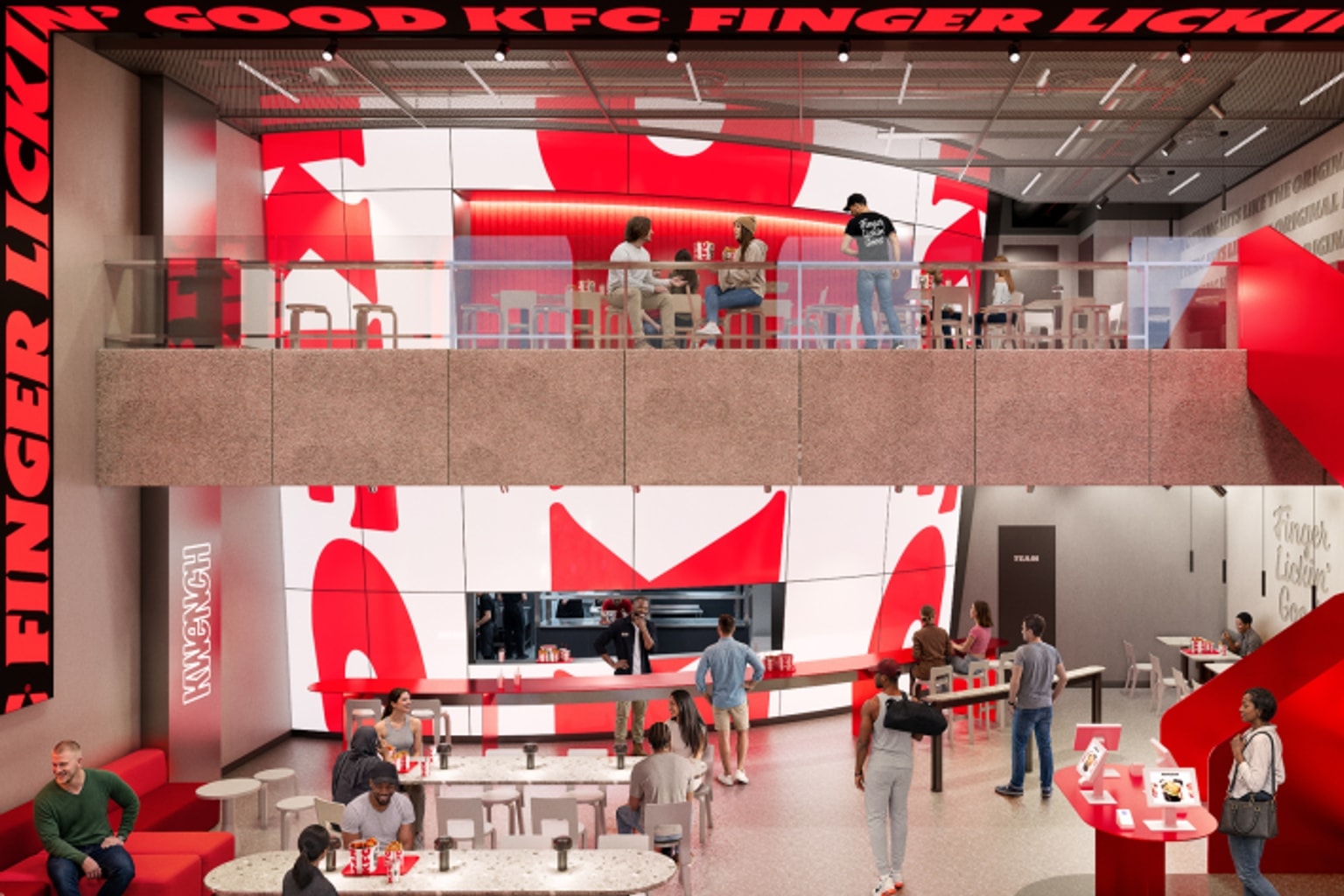
Dubbed the “Bucketverse,” this massive undertaking reimagines every consumer touchpoint by centering the entire brand ecosystem around its most recognizable asset: the iconic fried chicken bucket. The story matters because it offers a masterclass in how legacy brands can distill decades of history into a single, scalable visual concept that works seamlessly across diverse global markets.
Why it matters
The design community is now buzzing following a detailed report published by Creative Boom, which outlines the sheer scale of KFC’s latest visual overhaul. According to the publication, JKR has reworked virtually every aspect of the brand’s public-facing identity.
The rollout, which is now beginning its global implementation, introduces a suite of modernized assets designed to unify the restaurant chain’s presence worldwide.
Key features of the redesign include a newly rendered 3D logo, bespoke custom typefaces designed specifically for the brand, and a refreshed iteration of the legendary Colonel Sanders mascot. By focusing heavily on the “Bucketverse” concept, the agency has effectively taken the physical bucket—a long-standing symbol of communal dining and KFC’s heritage—and transformed it into a dynamic, multidimensional branding device.
The news is moving rapidly through marketing and design circles because executing a unified rebrand across 150 distinct international markets is a monumental logistical and creative challenge.
The catch
Beyond the surface-level aesthetic updates, the open question is the strategic thinking behind the “Bucketverse.” Why elevate the bucket to the center of the brand universe?
First, it represents a push toward universal visual simplicity. In a sprawling global market where linguistic and cultural barriers can dilute complex marketing messages, a distinct physical shape serves as a universal signifier.
The bucket transcends language. By building the identity around this specific silhouette, KFC ensures instant recognition whether a customer is interacting with the brand in Tokyo, London, or Kentucky.
Second, people are curious about how a traditional, heritage-heavy brand like KFC modernizes without alienating its core customer base. The introduction of a 3D logo and custom typography suggests a pivot toward digital-first applications.
As fast-food ordering increasingly shifts to mobile apps, delivery platforms, and digital kiosks, flat or purely traditional logos often struggle to stand out. The “Bucketverse” implies a flexible, spatial design system that can animate, rotate, and adapt to various screen sizes and digital environments, effectively bridging the gap between physical packaging and modern digital interfaces.
What to verify
While the initial announcement provides a strong conceptual overview, several practical details remain to be confirmed as the rollout progresses:
- Implementation timeline: How long will it take for the new “Bucketverse” assets to fully replace existing branding across all 150-plus countries, particularly regarding physical restaurant signage and legacy packaging?
- Typography specifics: Design enthusiasts will want to verify the exact characteristics and naming of the new custom typefaces, as well as the typographic foundries involved in their creation.
- Market adaptations: It will be important to observe how the refreshed Colonel and 3D logo are adapted to comply with local cultural nuances and regulatory requirements in specific international markets.
- Consumer reception: Tracking metric shifts in brand sentiment and digital engagement will reveal whether the 3D aesthetic resonates with modern consumers or if it faces pushback from brand traditionalists.
Source trail
The primary insights about this global brand evolution originate from Creative Boom’s coverage of the JKR redesign. For broader context on the agency’s approach to monumental legacy brand overhauls, observers often look to Jones Knowles Ritchie’s official portfolio, which showcases similar high-profile transformations in the food and beverage sector.
KFC is rolling out its largest-ever global brand evolution across more than 150 countries, driven by design agency JKR. By introducing a 3D logo, custom typefaces, and a refreshed Colonel Sanders, the new identity consolidates the brand’s visual language entirely around its iconic bucket, creating a flexible, digital-ready “Bucketverse” designed for universal global appeal.